Objectives
- Introduce the vegan package, which includes the primary tools most ecologists use for multivariate analysis in \({\bf\textsf{R}}\)
- Introduce clustering as a form of multivariate data analysis
- Fit cluster diagrams
- Identify known groups in cluster diagrams
- Find unknown groups via k-means clustering
Walking through the script
We jump right in to cluster analysis in this script as our first example of multivariate analysis. If you aren’t familiar with the differences between multivariate data and how their analysis is different from the univariate methods we’ve used so far, be sure to go over this introductory blog post.
The vegan package
vegan is the primary package for multivariate analysis of ecological data in \({\bf\textsf{R}}\).
pacman::p_load(tidyverse, vegan)The varechem dataset comes with vegan.
Load it and grab a few specific columns (note that it is already in wide format):
data("varechem")
chem_d <- select(varechem, N:Mo)
A scatterplot matrix allows one to see all univariate relationships in multivariate data:
varechem %>%
  select(N:Mo) %>%
    pairs(upper.panel = NULL)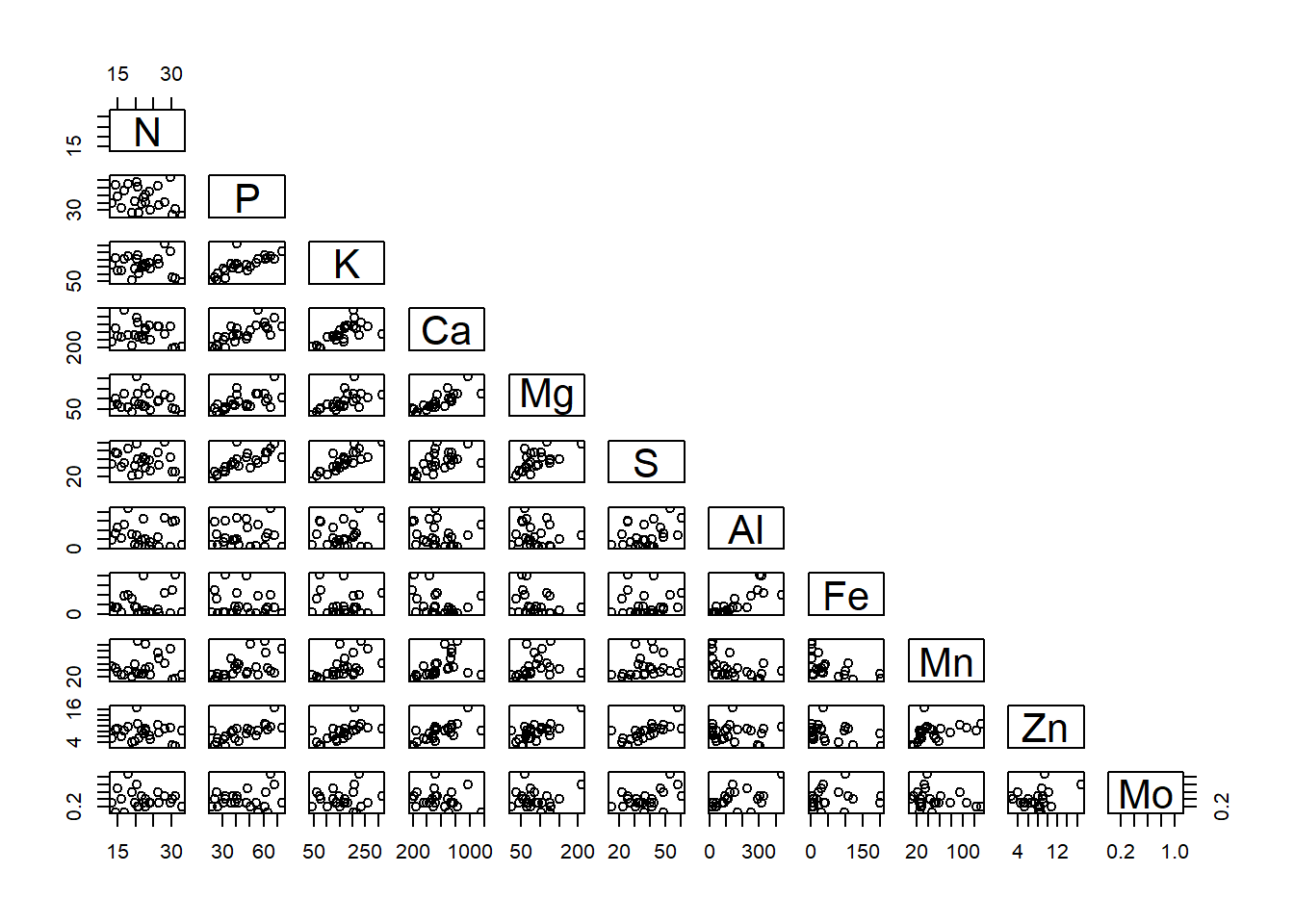
Calculating a distance matrix
vegan::vegdist calculates a distance matrix based on a wide variety of distance measures.
The default is Bray-Curtis (method='bray'), but we are focusing here on the Euclidean distance measure, so we need to set the method as so:
chem_m <- round(vegdist(chem_d, method="euclidean"), 1)The script below shows how the matrix has 276 elements.
The as.matrix call is modified to show just the first five rows and columns:
length(chem_m)## [1] 276 as.matrix(chem_m)[c(1:5), c(1:5)]## 18 15 24 27 23
## 18 0.0 173.5 486.5 342.0 266.9
## 15 173.5 0.0 636.7 498.8 430.8
## 24 486.5 636.7 0.0 230.6 247.3
## 27 342.0 498.8 230.6 0.0 113.7
## 23 266.9 430.8 247.3 113.7 0.0The value represents the Euclidean distances between each pair of sites, represented by their rows in the original data frame. From this sample of the matrix, the most similar sites are \(23\) and \(27\), which are \(113.7\) units apart, while the most dissimilar are \(15\) and \(24\), which are \(636.7\) units apart. As a matrix, the lower and upper halves are the same, with a diagonal axis of zero, because the distance between \(18\) and \(18 = 0.0\).
Fitting cluster diagrams
Calculate cluster diagram using stats::hclust.
There are several options for the method argument but I tend to start with ward.D2:
chem_clust <- hclust(chem_m, method="ward.D2") Base graphics::plot handles the hclust object to give us a cluster diagram.
We can use several plot arguments to refine the default graph:
plot(chem_clust, las = 1,
     main="Cluster diagram of soil chemistry",
     xlab="Sample",
     ylab="Euclidean distance")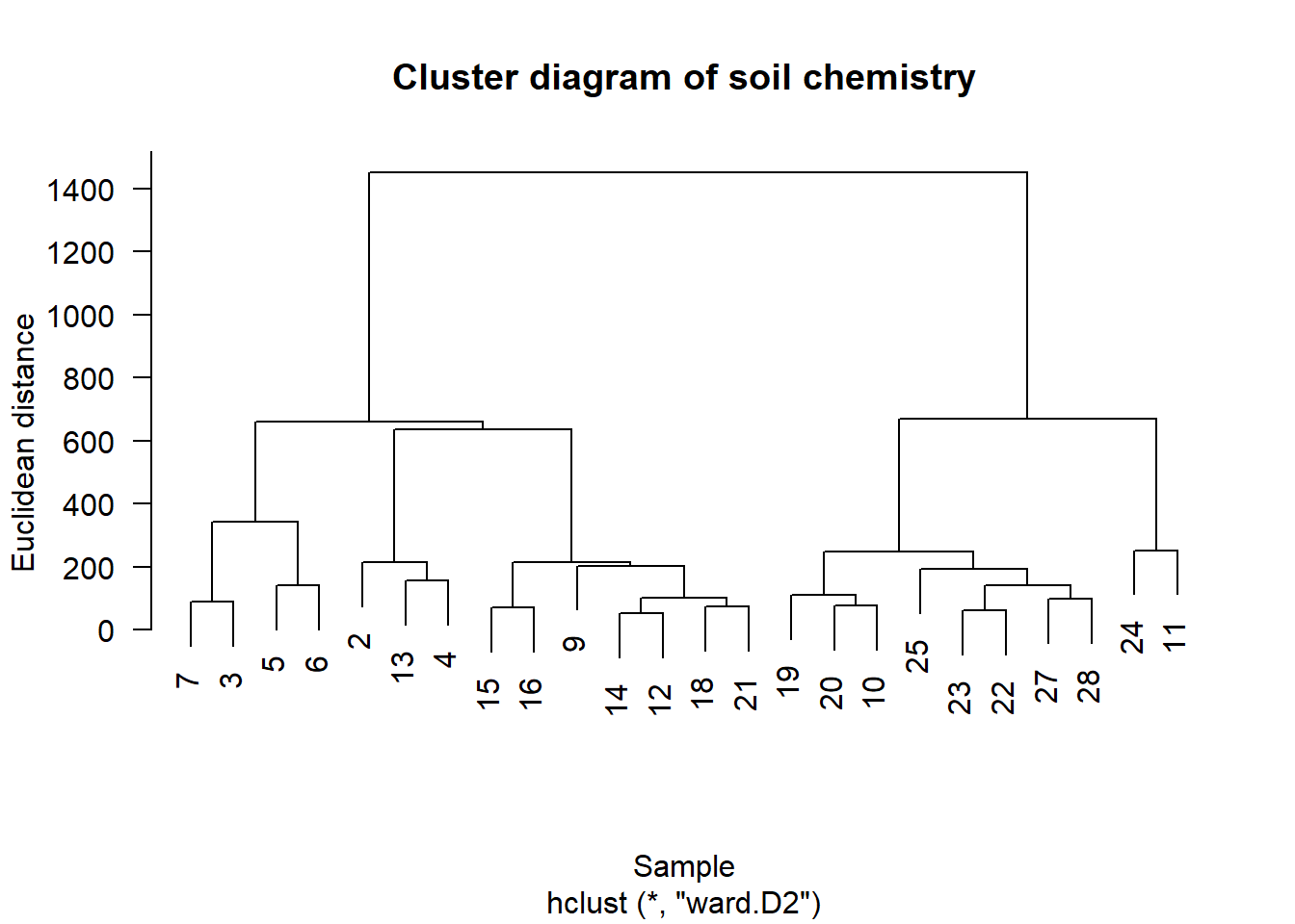
Visualize potential groups.
stats::rect.hclust cuts the tree at whatever height creates the given number of groups (alternatively, it can cut the tree into however many groups occur at a specific height):
plot(chem_clust, las = 1,
     main="Cluster diagram of soil chemistry",
     xlab="Sample", ylab="Euclidean distance")
    rect.hclust(chem_clust, 2, border="red")
    rect.hclust(chem_clust, 4, border="blue")
    rect.hclust(chem_clust, 5, border="darkgreen")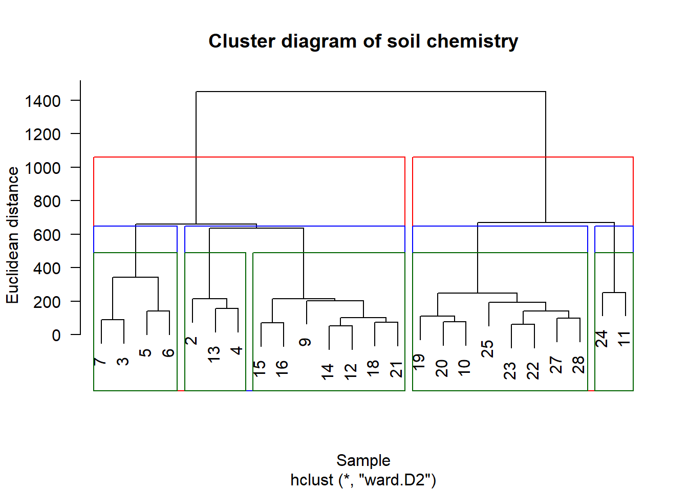
k-means clustering
How many groups is the right number of groups? A general solution: is called k-means clustering, which uses an iterative algorithm to determine the optimal number of groups, usually by minimizing some error criterion to denote the best fit.
vegan::cascadeKM
There are many options for k-means clustering in \({\bf\textsf{R}}\), spread across many packages.
Here we use vegan::cascadeKM, a wrapper for the base stats::kmeans:
fit <- cascadeKM(chem_d, 1, 10, iter = 5000)Base graphics::plot returns the default plot of the cascadeKM object:
plot(fit, sortg = TRUE, grpmts.plot = TRUE)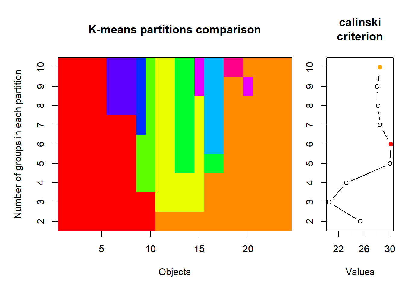
Howerver we’re only interested in the graph of the Calinski criterion, so let’s use dplyr and ggplot to focus on the $results part of the object:
Note: The lecture video has slightly different wrangling steps at the top of the pipe that do not work in more recent \({\bf\textsf{R}}\) versions. The script has been updated to work in \({\bf\textsf{R}}\) v.4.0.2, and is backwards-compatible with v.3.5.3, as well.
  fit$results %>%
        as.data.frame() %>%
        rownames_to_column("metric") %>%
          pivot_longer(names_to = "groups",
                       values_to = "value",
                       - metric) %>%
        mutate(groups = str_extract(groups, "\\d+"),
               groups = as.numeric(groups)) %>%
  filter(metric != "SSE") %>%
  ggplot(aes(x=groups, y = value)) + theme_bw(16) +
  geom_line(lwd=1.5, col="blue") +
  geom_point(pch=21, col="lightgrey",
             bg="blue", stroke = 1.5, size=5) +
  scale_x_continuous(breaks = c(2:10), labels = c(2:10)) +
theme(panel.grid.minor.x = element_blank()) 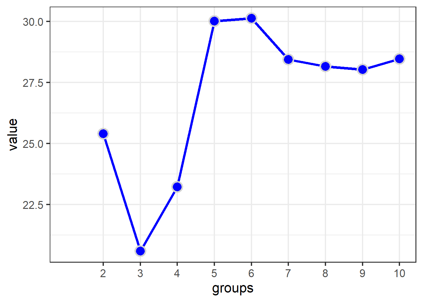
View the optimal number of groups.
grps <- as_tibble(fit$partition)
grps
## # A tibble: 24 x 10
## `1 groups` `2 groups` `3 groups` `4 groups` `5 groups` `6 groups` `7 groups`
## <int> <int> <int> <int> <int> <int> <int>
## 1 1 2 1 1 3 1 4
## 2 1 2 1 1 3 1 4
## 3 1 1 2 3 5 4 7
## 4 1 1 2 2 2 2 2
## 5 1 1 2 2 2 2 2
## 6 1 1 2 2 2 2 2
## 7 1 1 2 2 2 2 2
## 8 1 2 1 1 3 1 4
## 9 1 1 2 2 2 2 2
## 10 1 2 3 4 4 3 1
## # … with 14 more rows, and 3 more variables: `8 groups` <int>, `9
## # groups` <int>, `10 groups` <int>To see Which sites are in which groups, we can label the cluster diagram by group assignment from the optimal k-means result:
plot(chem_clust, las = 1,
     label = grps$`5 groups`,
  main="Cluster diagram of soil chemistry",
  xlab="Sample", ylab="Euclidean distance")
rect.hclust(chem_clust, 5, border="red") 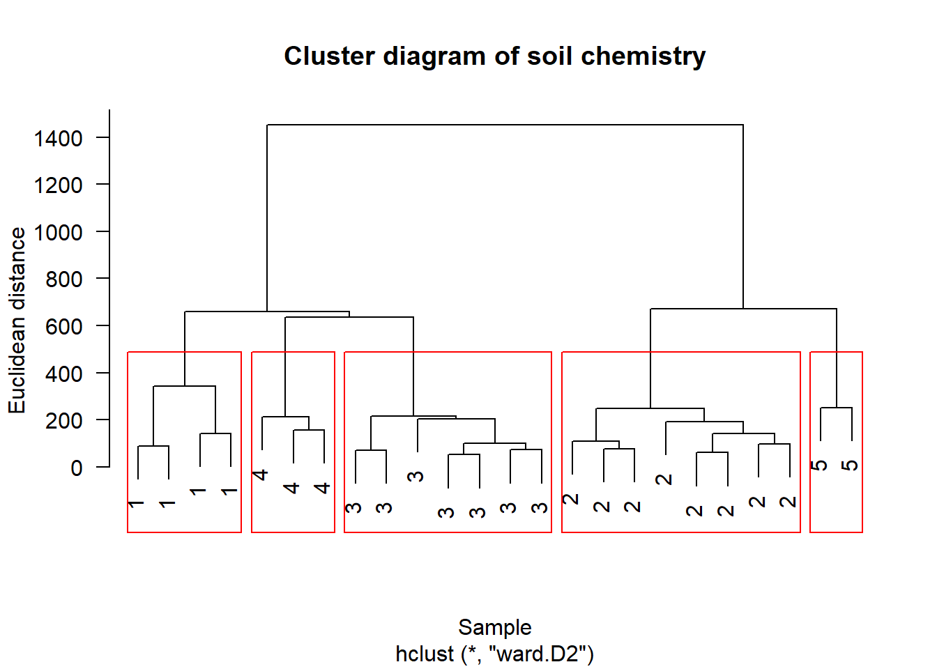
Clustering on scaled data
head(chem_d)## N P K Ca Mg S Al Fe Mn Zn Mo
## 18 19.8 42.1 139.9 519.4 90.0 32.3 39.0 40.9 58.1 4.5 0.3
## 15 13.4 39.1 167.3 356.7 70.7 35.2 88.1 39.0 52.4 5.4 0.3
## 24 20.2 67.7 207.1 973.3 209.1 58.1 138.0 35.4 32.1 16.8 0.8
## 27 20.6 60.8 233.7 834.0 127.2 40.7 15.4 4.4 132.0 10.7 0.2
## 23 23.8 54.5 180.6 777.0 125.8 39.5 24.2 3.0 50.1 6.6 0.3
## 19 22.8 40.9 171.4 691.8 151.4 40.8 104.8 17.6 43.6 9.1 0.4Re-do with scaled data
chem_s <- scale(chem_d)
head(chem_s)
## N P K Ca Mg S
## 18 -0.46731082 -0.1993234 -0.35515620 -0.2063474 0.06197472 -0.4192440
## 15 -1.62503567 -0.4000407 0.06740707 -0.8742950 -0.40862677 -0.1706973
## 24 -0.39495301 1.5134640 0.68120335 1.6570911 2.96604924 1.7919646
## 27 -0.32259521 1.0518143 1.09142901 1.0852097 0.96904082 0.3006844
## 23 0.25626722 0.6303080 0.27251990 0.8512022 0.93490392 0.1978375
## 19 0.07537271 -0.2796103 0.13063734 0.5014226 1.55912145 0.3092550
## Al Fe Mn Zn Mo
## 18 -0.84593420 -0.1441300 0.25864016 -1.0374987 -0.39933821
## 15 -0.44452932 -0.1755615 0.09055477 -0.7358840 -0.39933821
## 24 -0.03658425 -0.2351160 -0.50806512 3.0845688 1.68416550
## 27 -1.03887014 -0.7479458 2.43785248 1.0402914 -0.81603896
## 23 -0.96692792 -0.7711059 0.02273085 -0.3337311 -0.39933821
## 19 -0.30800262 -0.5295796 -0.16894547 0.5040875 0.01736253chem_m2 <- vegdist(chem_s, method="euclidean")
chem_clust2 <- hclust(chem_m2, method="ward.D2")Plot cluster diagram
plot(chem_clust2, las = 1,
     main="Cluster diagram of (scaled) soil chemistry",
     xlab="Sample", ylab="Euclidean distance")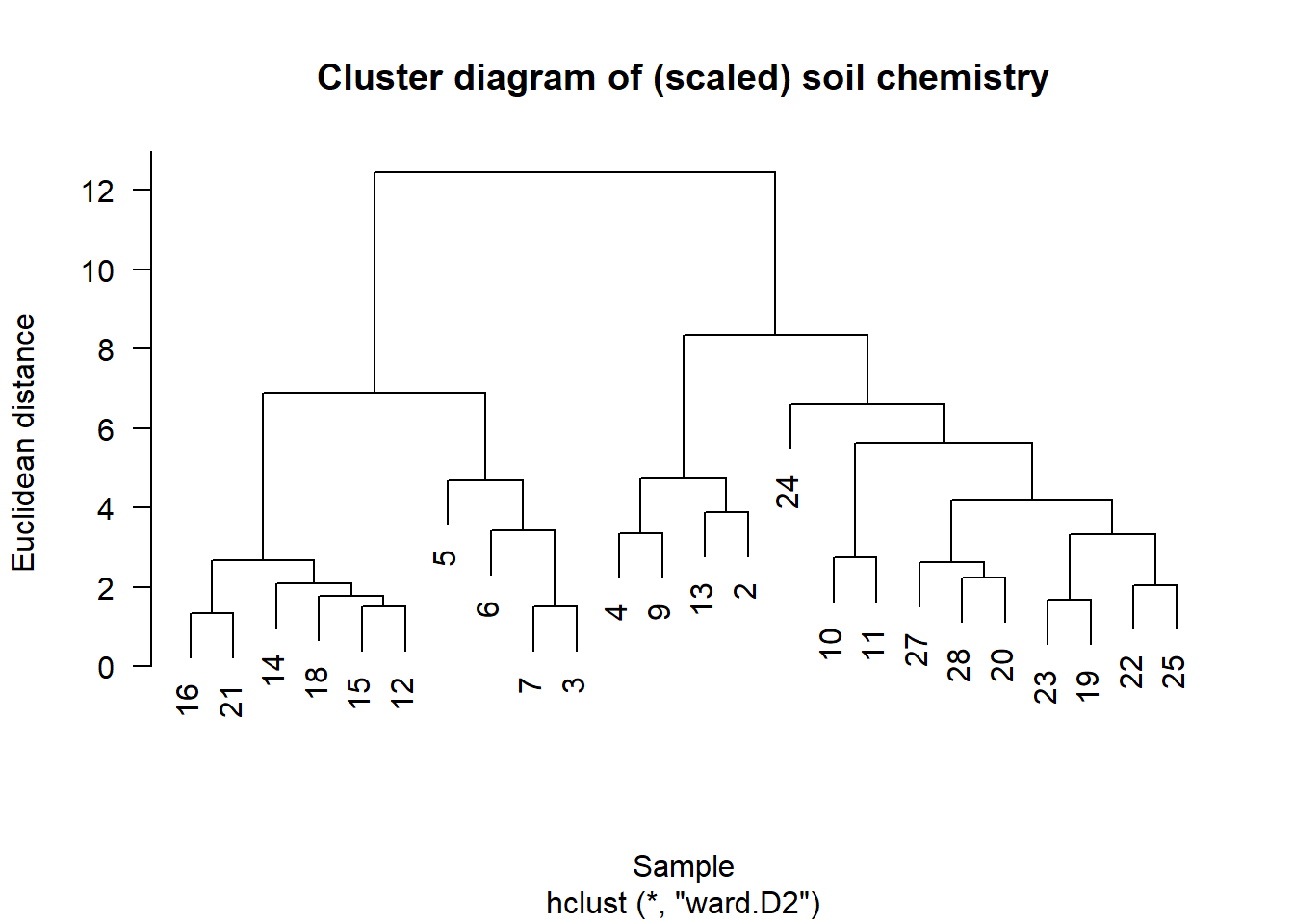
fit_s <- cascadeKM(chem_s, 1, 10, iter = 5000)

fit_s$results %>%
        as.data.frame() %>%
        rownames_to_column("metric") %>%
          pivot_longer(names_to = "groups",
                       values_to = "value",
                       - metric) %>%
  mutate(groups = str_extract(groups, "\\d+"),
         groups = as.numeric(groups)) %>%
  filter(metric != "SSE") %>%
  ggplot(aes(x=groups, y = value)) + theme_bw(16) +
  geom_line(lwd=1.5, col="blue") +
  geom_point(pch=21, col="lightgrey",
             bg="blue", stroke = 1.5, size=5) +
  scale_x_continuous(breaks = c(2:10), labels = c(2:10)) +
  theme(panel.grid.minor.x = element_blank())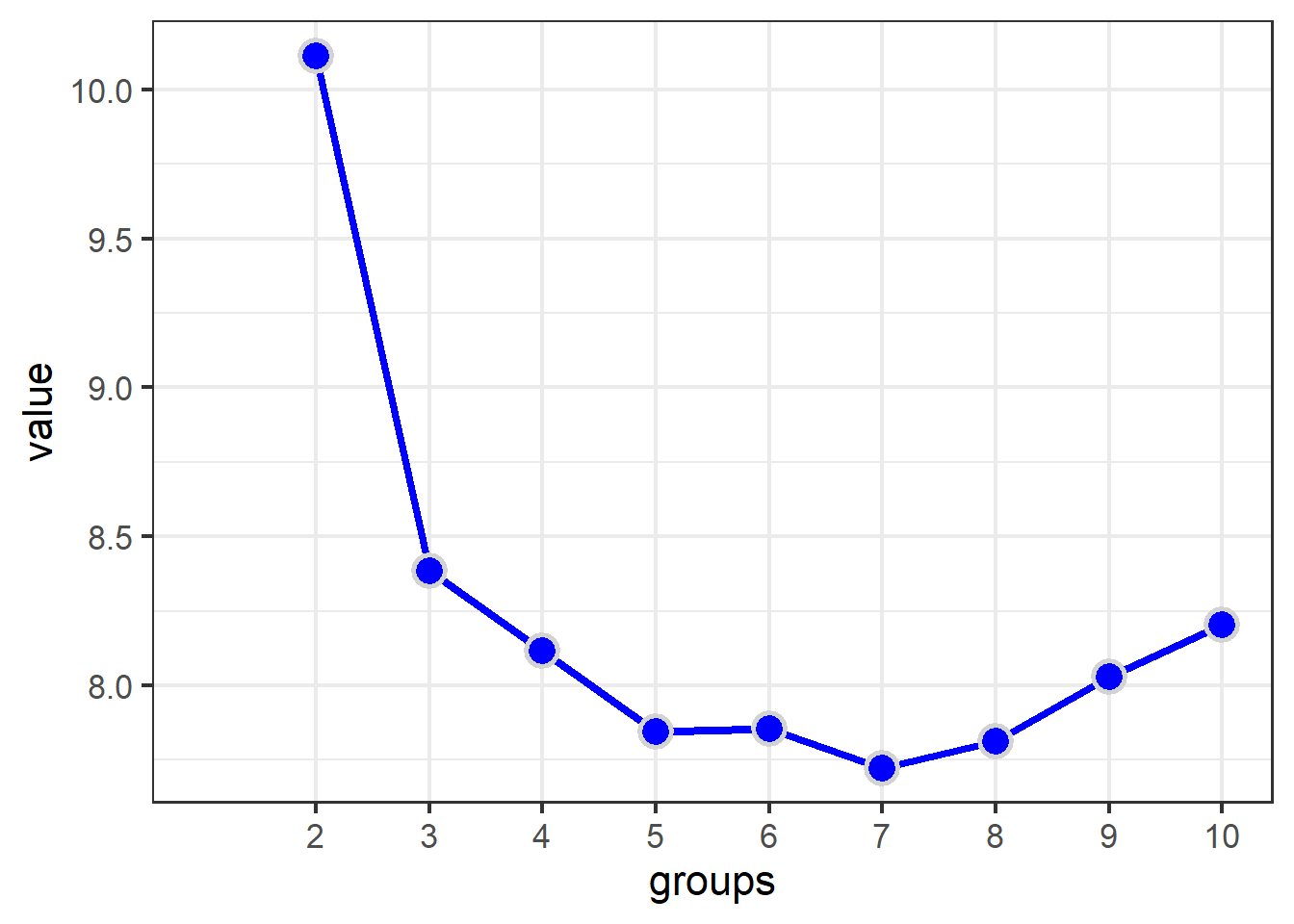
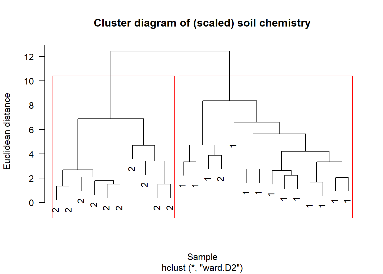
Label plot by group assignment
plot(chem_clust2, las = 1,
     label = as_tibble(fit_s$partition)$`2 groups`,
     main="Cluster diagram of (scaled) soil chemistry",
     xlab="Sample", ylab="Euclidean distance")
rect.hclust(chem_clust2, 2, border="red")