Objectives
- Practice
ggplotbasics - Learn new
geomsto explore patterns within datageom_boxplotgeom_violingeom_jitter
- Clearly plot group means and variance with
geom_errorbarandposition_dodge - Connect repeated measures data through time with
geom_lineandaes(group=) - De-emphasize plot elements with
alpha=
Walking through the script
Load packages & view data ChickWeight, which comes with \({\bf\textsf{R}}\):
pacman::p_load(tidyverse)
(ChickWeight <- as_tibble(ChickWeight))
## # A tibble: 578 x 4
## weight Time Chick Diet
## <dbl> <dbl> <ord> <fct>
## 1 42 0 1 1
## 2 51 2 1 1
## 3 59 4 1 1
## 4 64 6 1 1
## 5 76 8 1 1
## 6 93 10 1 1
## 7 106 12 1 1
## 8 125 14 1 1
## 9 149 16 1 1
## 10 171 18 1 1
## # … with 568 more rowsBoxplots
Boxplots are ideal for plotting continous data across two or more levels of a categorical variable (<fct> or <chr> in tibble).
To get started, use filter() to trim the dataset down to last round of (Time)
EndWeight <- filter(ChickWeight, Time==max(Time))
EndWeight
## # A tibble: 45 x 4
## weight Time Chick Diet
## <dbl> <dbl> <ord> <fct>
## 1 205 21 1 1
## 2 215 21 2 1
## 3 202 21 3 1
## 4 157 21 4 1
## 5 223 21 5 1
## 6 157 21 6 1
## 7 305 21 7 1
## 8 98 21 9 1
## 9 124 21 10 1
## 10 175 21 11 1
## # … with 35 more rowsLet’s use tidyverse verbs to tweak the appearance and make this boring Diet variable more fun:
EndWeight <- mutate(EndWeight,
                      ActualDiet =
                        recode(Diet,
                          "1"="corn",
                          "2"="oats",
                          "3"="burgers",
                          "4"="tacos") )
It shouldn’t be a surprise that geom_boxplot is what we use to get a boxplot out of ggplot:
ggplot(EndWeight) +
  geom_boxplot(aes(x=ActualDiet, y=weight))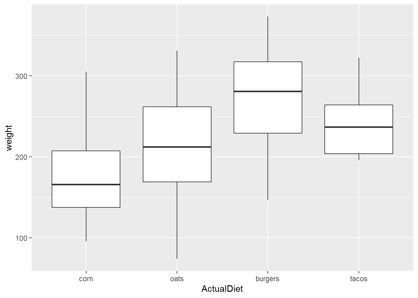
Note that the default order for levels of vectors stored as characters is alphabetical.
We can reorder the X axis by applying a function to Y values (in this case, median).
A conventional way to do this would be to add reorder() to aes():
ggplot(EndWeight,
       aes(x=reorder(ActualDiet, weight, median),
           y=weight)) +
  geom_boxplot()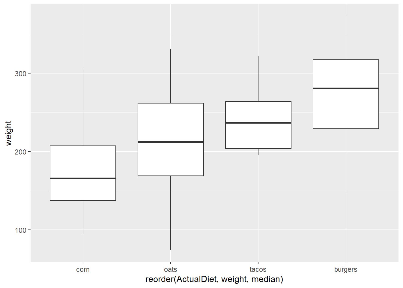
An alternative is to modify the variable with mutate() and pipe the data in.
Note the difference in the X axis label between these two graphs.
EndWeight %>%
  mutate(ActualDiet = reorder(ActualDiet, weight, median)) %>%
ggplot(aes(x=ActualDiet, y=weight)) +
  geom_boxplot()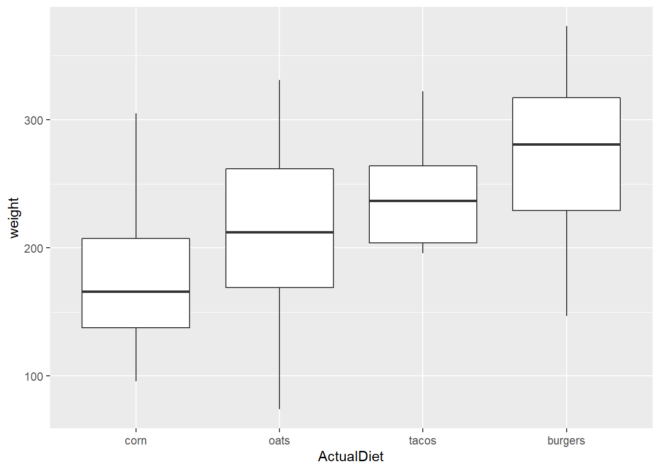
reorder() allows one to easily reverse the direction by reordering Y variable on the opposite sign:
EW_gg <-
  EndWeight %>%
    mutate(ActualDiet = reorder(ActualDiet, -weight, median)) %>%
  ggplot(aes(x=ActualDiet, y=weight))
EW_gg + geom_boxplot()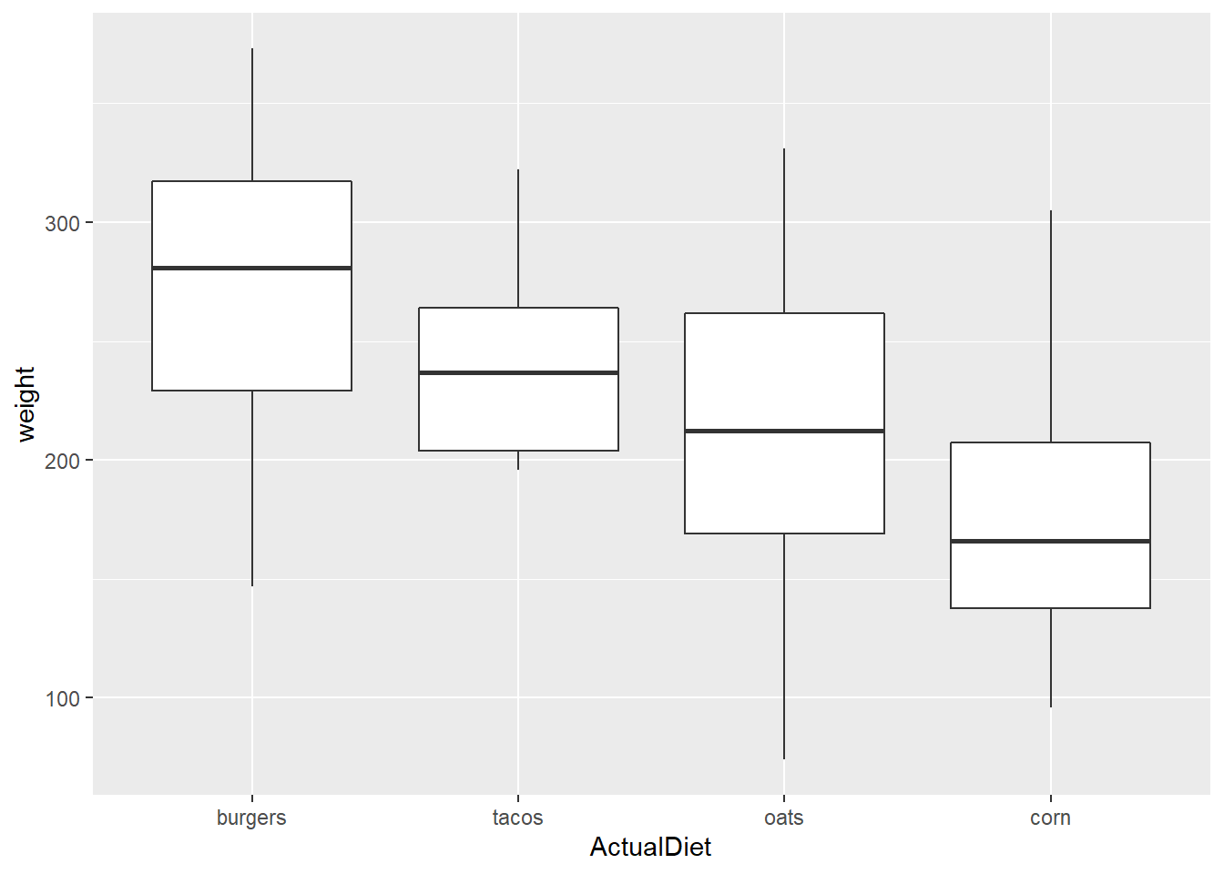
Remember we can use labs() to give clearer axis labels:
EW_gg <- EW_gg + labs(x="Chick diet",
                      y="End weight (g)")
EW_gg + geom_boxplot() 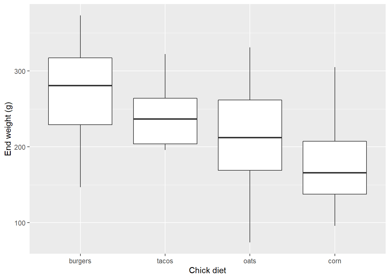
geom_jitter
Boxplots are useful because they provide insight into the distribution of the data.
But they can still obscure some trends.
ggplot offers a couple tricks to get more information about where data actually are in the distribution.
Firstly, we could add the data points themselves…
EW_gg + geom_boxplot() +
geom_point() 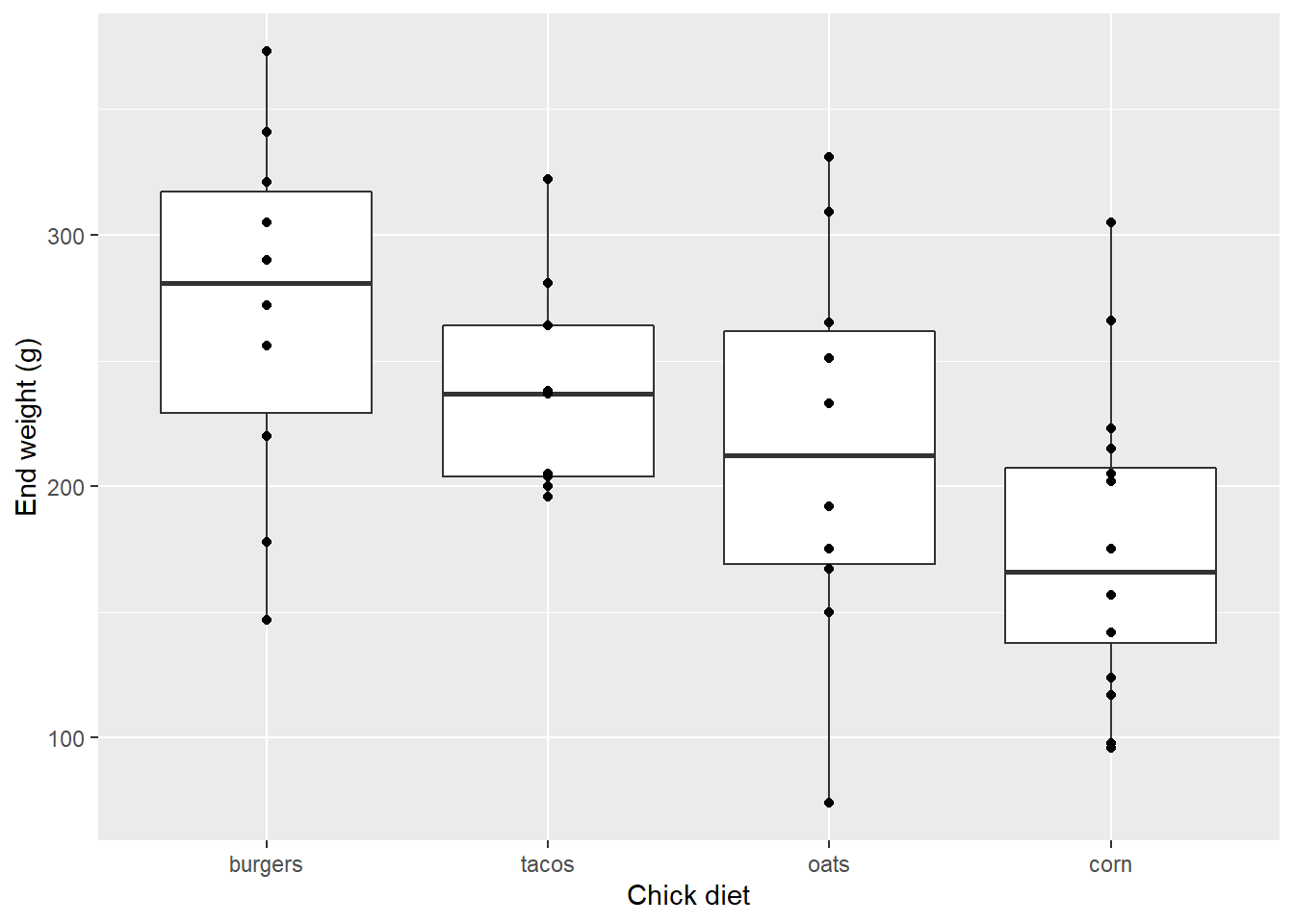
…but this clearly doesn’t show all of the data:
EndWeight %>%
  group_by(ActualDiet) %>%
  summarize(Count = n())
## # A tibble: 4 x 2
## ActualDiet Count
## <fct> <int>
## 1 corn 16
## 2 oats 10
## 3 burgers 10
## 4 tacos 9Notice how in each case, fewer data points appear in the graph than chicks actually fed each diet. Clearly a few points are overlapping.
Adding jitter is the addition of some side-to-side noise and reduce the overlap of points with similar Y values:
EW_gg + geom_boxplot() +
        geom_jitter()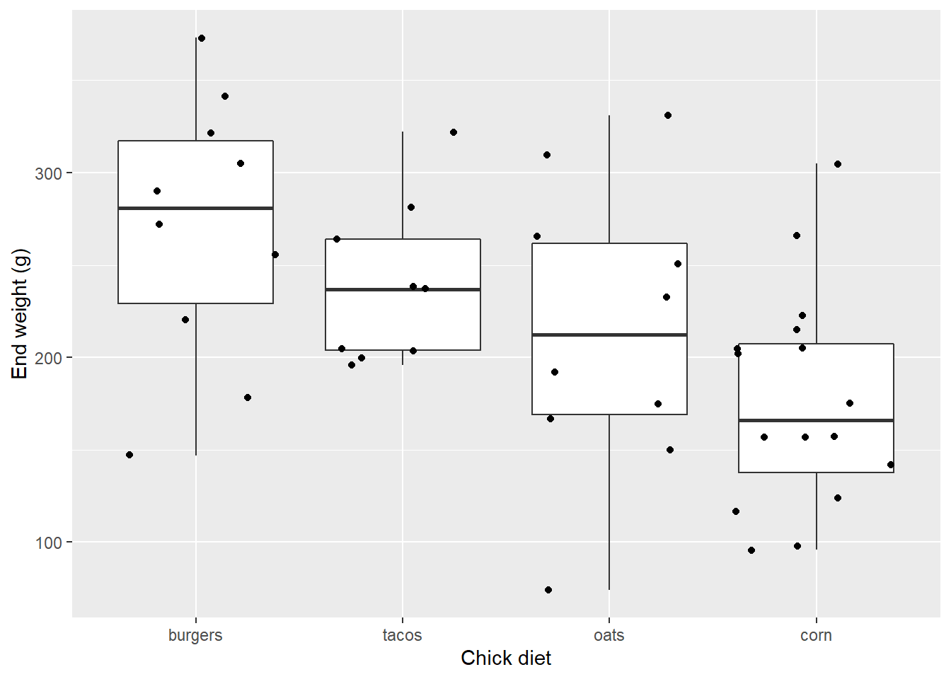
Ok maybe that’s too much noise.
EW_gg + geom_boxplot() +
  geom_jitter(width=0.15)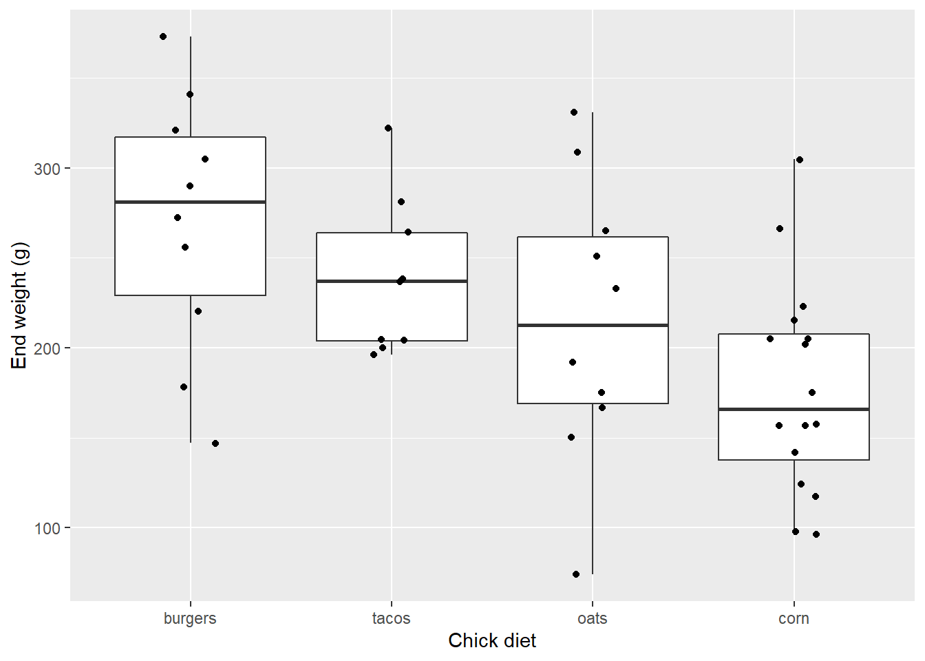
geom_jitter supports several options.
Here we use one of the two-color points, 21 (pch is a base graphical parameter short for something like point character that is synoymous with shape):
EW_gg + geom_boxplot() +
  geom_jitter(width=0.15,
              pch=21,
              stroke=1.5,
              color="black",
              fill="red")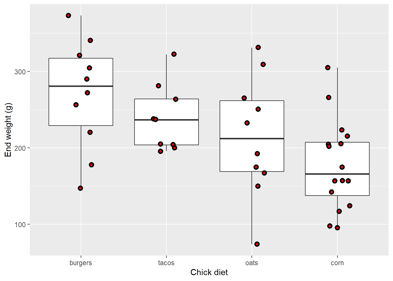
geom_violin
An alternative to boxplots are violin plots, which instead of showing fixed quantiles of the data, plot a smoother pattern of the distribution. Wider parts have a relatively greater number of points at that value:
EW_gg + geom_violin()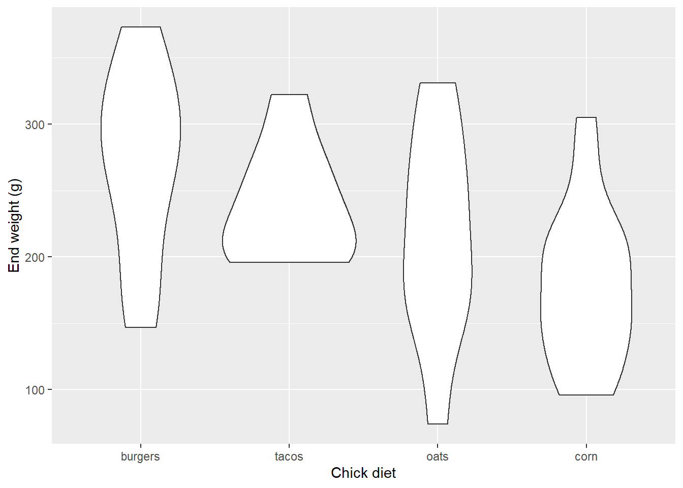
The quantiles can be represented, as well…
EW_gg + geom_violin(draw_quantiles= c(0.25, 0.5, 0.75))
EW_gg + geom_violin(draw_quantiles= c(0.5)) 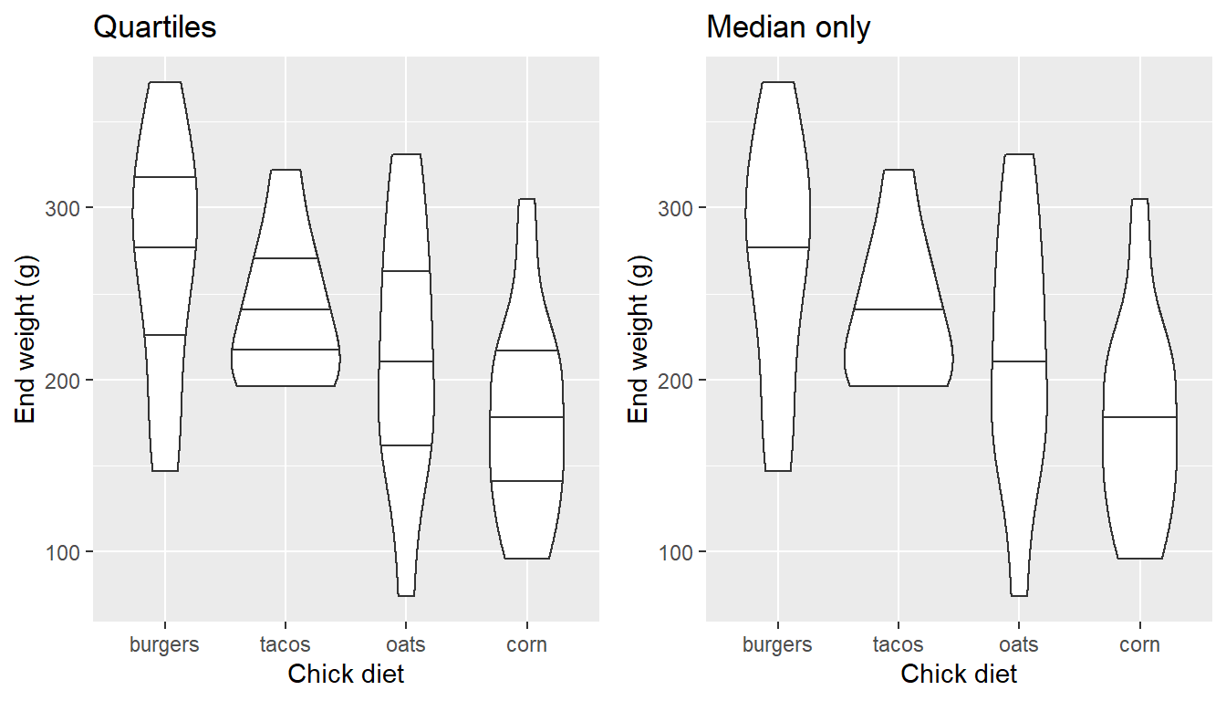
… as can the data:
EW_gg + geom_violin(draw_quantiles= c(0.25, 0.5, 0.75)) +
  geom_jitter(width=0.15,
              pch=21,
              stroke=1.5,
              color="black",
              fill="red")
Plotting error bars
Despite the value of boxplots and violin plots, there are some reasons why they won’t work in all cases, especially for publication:
- They can take up too much space, or get scrunched in small plots with several levels.
- They don’t show what typical statistical models actually test–differences in means based on symetrical error (e.g., mean ± s.e., mean ± s.d.)
- Some folks are unfamiliar with them
- Some folks just don’t like them
Whatever the reason, when you move from the data exploration phase to presentation phase, you’ll want to plot point and whisker graphs with mean and error. “Dynamite plots” are not an option; see Dynamite plots: Unmitigated evil? and links therein.
EWsumm <- EndWeight %>%
            group_by(ActualDiet) %>%
              summarise(
                 mean=mean(weight),
                 sem=sd(weight)/sqrt(length(weight)) )
Note that \({\bf\textsf{R}}\) doesn’t really have a function for standard error, which is defined as
\(\sigma_x = \frac{\sigma}{\sqrt{n}}\)
where
\(\sigma\) is standard deviation sd(), and
\(n\) is the sample size, calculated as the length() of the vector.1
geom_errorbar
Let’s build up the dot-whisker graph. We’ll start with plotting the means as points…
EW_gg <-
  EWsumm %>%
    mutate(ActualDiet = reorder(ActualDiet, -mean, max)) %>%
ggplot(aes(x=ActualDiet, y=mean))
EW_gg + geom_point() 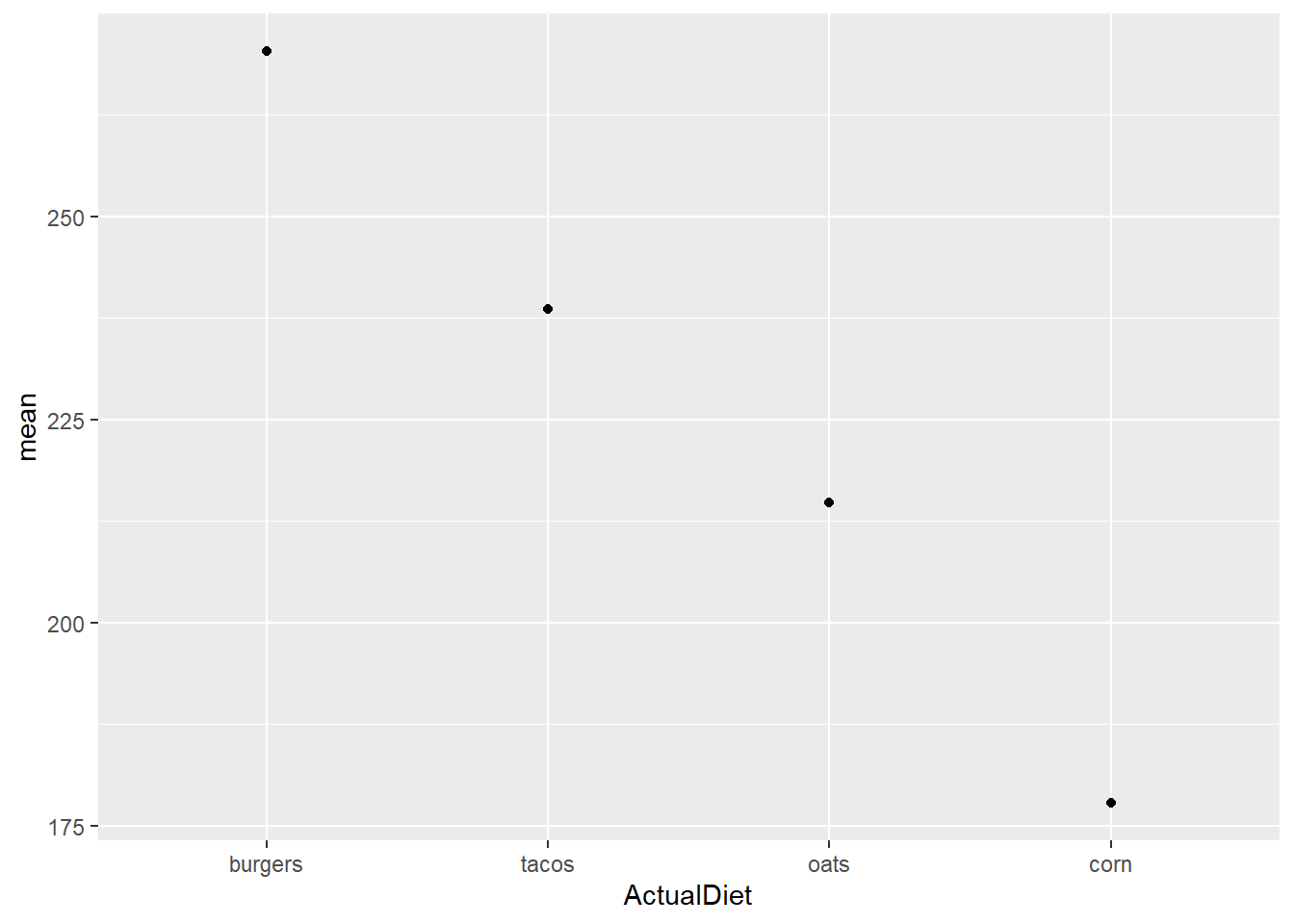
… then add the error bars using geom_errorbar:
EW_gg + geom_point() +
        geom_errorbar(aes(ymin=mean-sem,
                          ymax=mean+sem))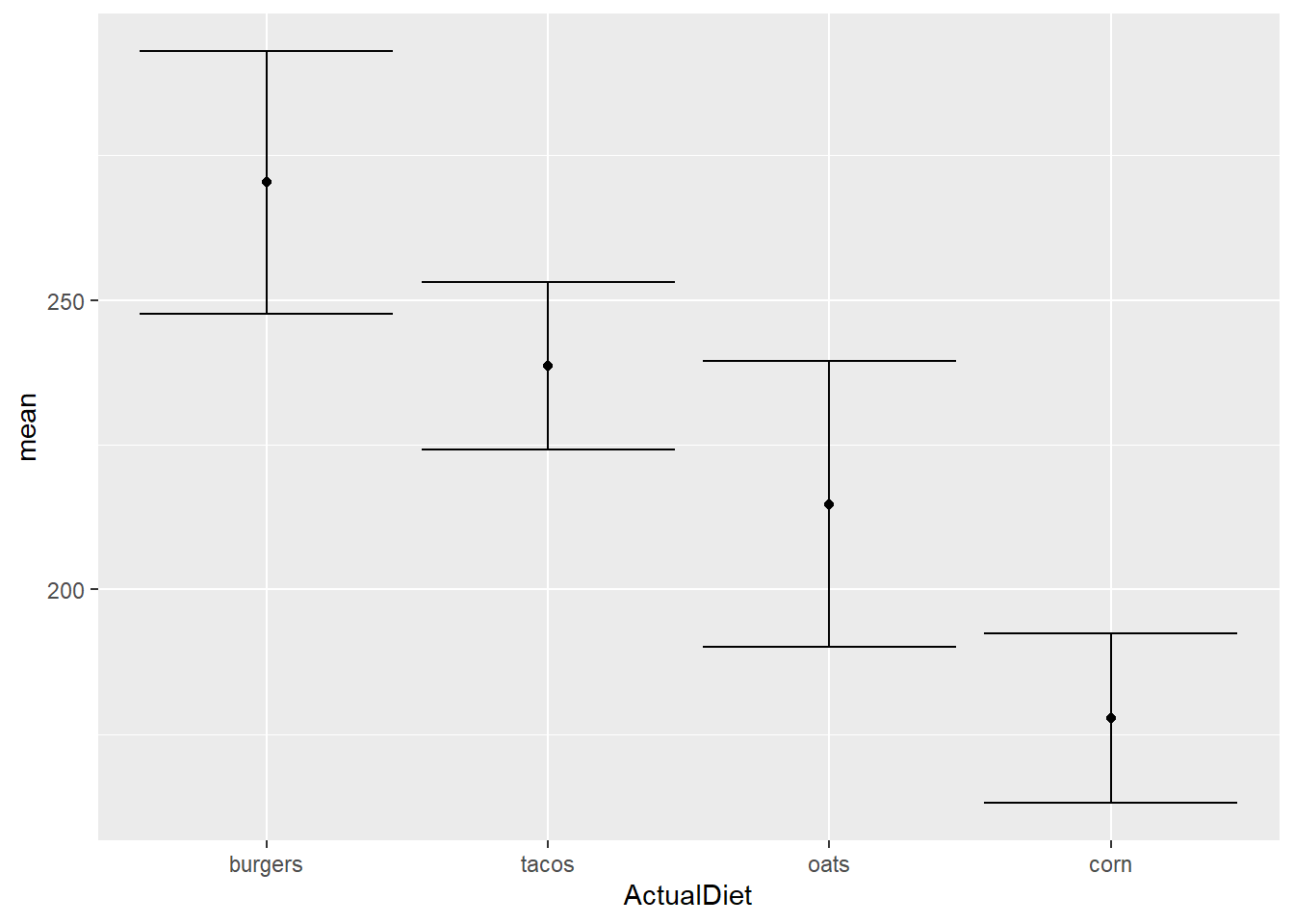
Let’s rein in those whiskers:
EW_gg + geom_point() +
  geom_errorbar(aes(ymin=mean-sem,
                    ymax=mean+sem),
                width=0.25)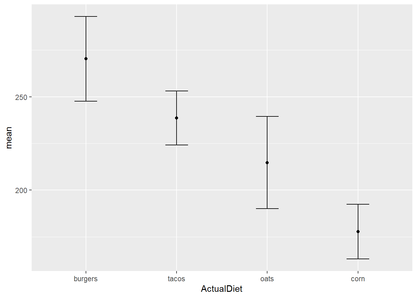
A couple of things to note about this call to ggplot():
geom_errorbarhas unique aesthetics: note howaes()requires arguments for the endpoints,yminandymax. This is consistent with the convention of describing error as mean ± s.e.geom_errorbaris also useful for plotting confidence intervals, but these are generally entered as absolute values themselves (ymin =2.5%,ymax =97.5%) and not relative to a measure of central tendency.geom_errorbaralso requiresaes(x=), which in this case is used by bothgeomsbecause was given in the originalggplot()call that assignedEW_gg; recall we adjusted the order of the X axis.
We can use other optional arguments to improve the appearance of the plot:
EW_gg + geom_errorbar(aes(ymin=mean-sem,
                    ymax=mean+sem),
                width=0.25) +
        geom_point(shape=21,
                   color="black",
                   fill="white",
                   size=3,
stroke=1.5) 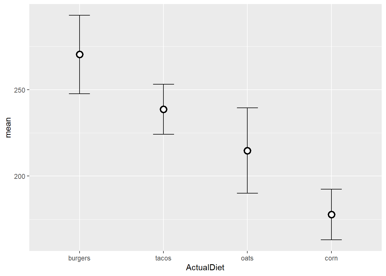
Note:
- I always plot
geom_errorbarfirst so that the points sit on top of the error bars, neither point borders nor fill are broken by the vertical bar. stroke=defines the width of the point border.
Additional variables
Let’s go back to the original boring Diet column and add a couple new (fake) variables:
ChickWeight <-
    ChickWeight %>%
      mutate(Grain = recode(Diet,
                      "1"="corn",
                      "2"="corn",
                      "3"="oats",
                      "4"="oats" ),
            Source = recode(Diet,
                      "1"="conventional",
                      "2"="organic",
                      "3"="conventional",
                      "4"="organic"))
 EndWeight <- filter(ChickWeight, Time==max(Time))
Then we re-calculate summary stats for both new levels:
EWsumm <-
  EndWeight %>%
    group_by(Grain, Source) %>%
      summarise(
          mean=mean(weight),
          sem=sd(weight)/sqrt(length(weight)) ) %>%
    ungroup()
It is easy to add the second variable to a boxplot by adding aes(fill=)…
EndWeight %>%
  mutate(Grain = reorder(Grain, -weight, median)) %>%
    ggplot(aes(x=Grain, y=weight)) +
      geom_boxplot(aes(fill=Source))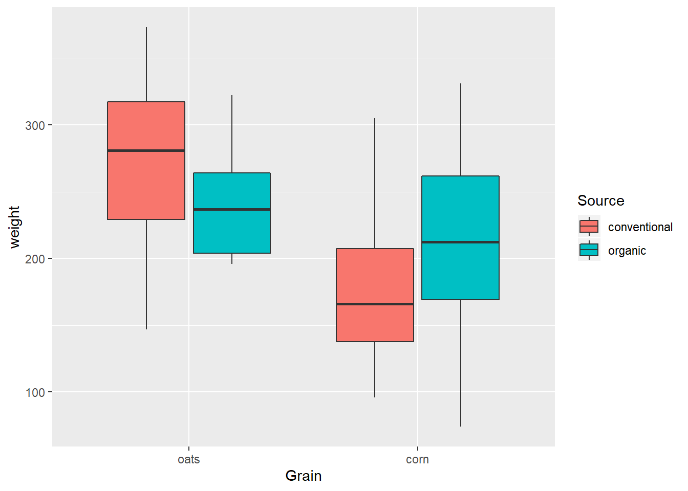
… but things get messy when we try to do the same for the dot-whisker plot (this time with aes(color=), which would only change the outline of the boxes in a boxplot if we didn’t use fill):
EWsumm %>%
  mutate(Grain = reorder(Grain, -mean, max)) %>%
    ggplot(aes(x=Grain,
               y=mean,
               color=Source)) +
      geom_errorbar(aes(ymin=mean-sem,
                        ymax=mean+sem)) +
geom_point() 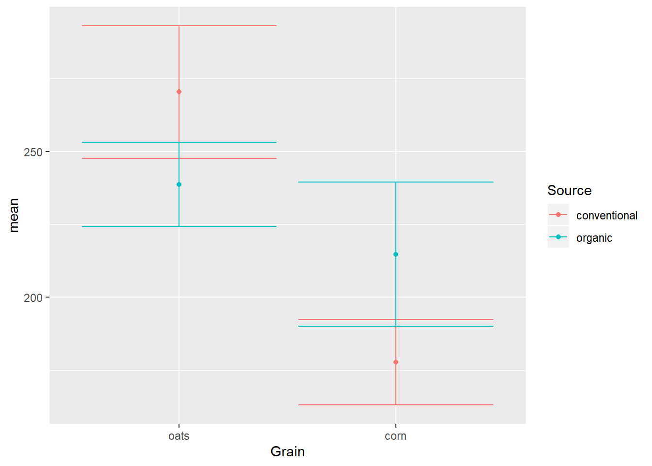
Notice again how aesthetics defined in the ggplot() call are applied within geoms, especially x=Grain and color=Source, which are required for both geoms.
position_dodge
The solution to the overlap is the position_dodge option of the position= argument, which kind of like jittering adds side-to-side space, but this time the distance is fixed instead of random noise:
EWsumm %>%
  mutate(Grain = reorder(Grain, -mean, max)) %>%
    ggplot(aes(x=Grain,
               y=mean,
               color=Source)) +
    geom_errorbar(aes(ymin=mean-sem,
                      ymax=mean+sem),
                  width=0.15,
                  position=position_dodge(width = 0.25)) +
    geom_point(position=position_dodge(width = 0.25))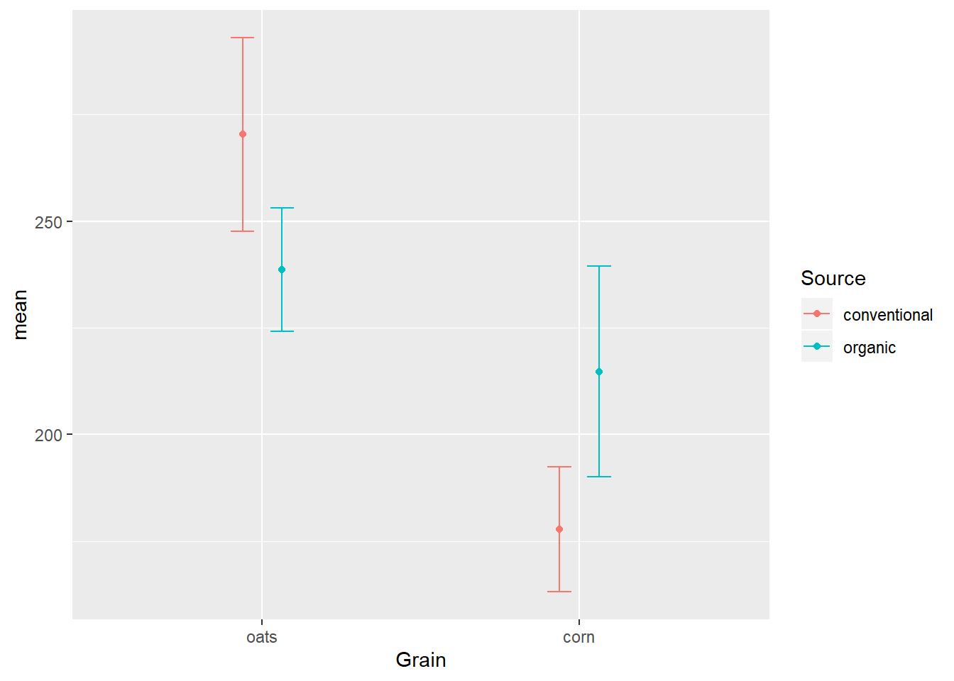
It is very important that the position= argument be defined the same in both geoms lest they not properly overlap.
Show data while emphasizing trends
Even though statistics are often based on determining whether moments of central tendency (e.g., means) are different based on the spread of data around them (e.g., variance), sometimes it is meaningful to visualize trends in the underlying data.
For example, the ChickWeight data are actually a time series:
ggplot(ChickWeight, aes(x=Time, y=weight)) +
geom_point() 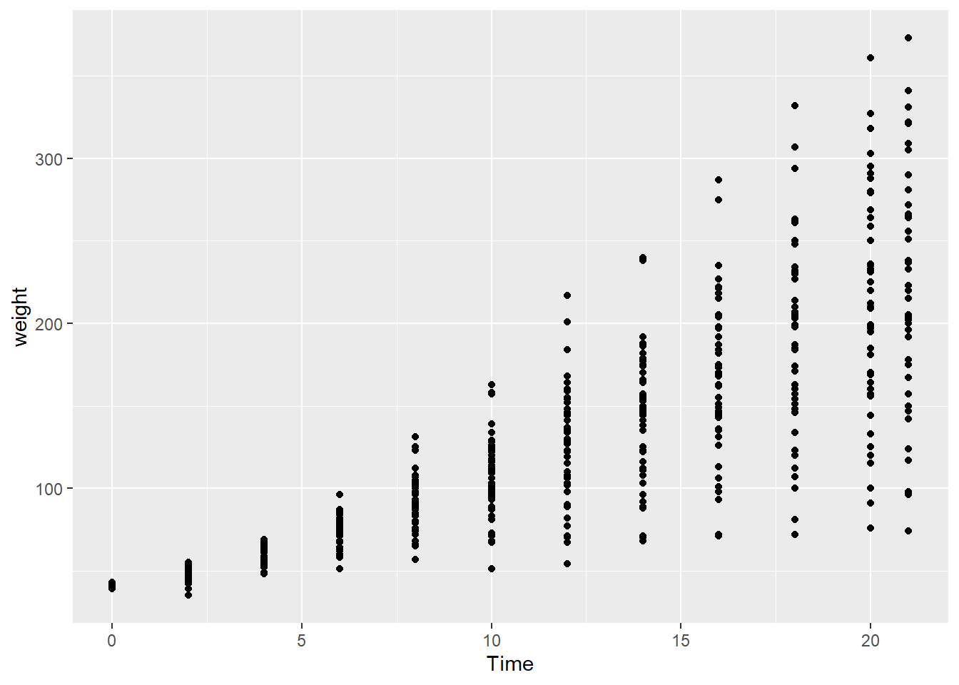
While growth can be defined as the average weight of chicks fed a given diet at a specific point in time, these data are not independent. Therefore, the weight of a group of chicks at one time series is to some degree determined by the weights of those same chicks in previous time steps. In this case, it might be insightful to see how the weight of individual chicks changed over time, in addition to the overall differences in diet groups.
Here we use geom_line with aes(group=) to connect individual observations of each chick over time:
ggplot(ChickWeight, aes(x=Time, y=weight)) +
  geom_point() +
  geom_line(aes(group=Chick))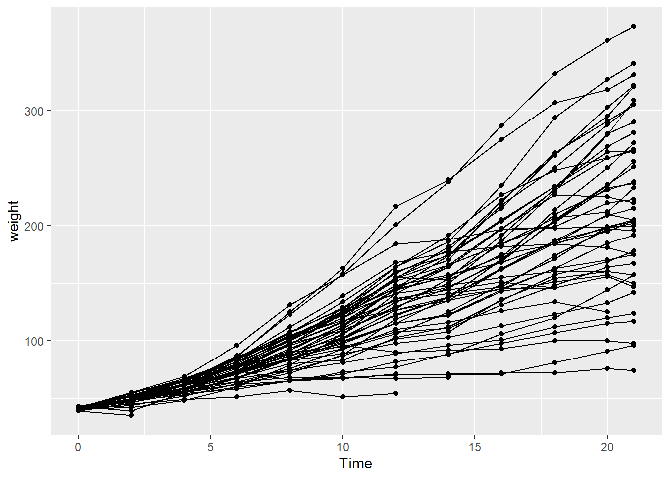
But this is kind of messy, and diverges from the main question: How does chick weight vary by diet group?
This latter part requires summarized data, this time by diet group and time step:
TSsumm <-
  ChickWeight %>%
    group_by(Grain, Time) %>%
      summarise(
         mean=mean(weight),
         sem=sd(weight)/sqrt(length(weight)) )

TS_gg <- ggplot(TSsumm, aes(x=Time,
                            y=mean,
                            color=Grain)) +
          geom_errorbar(aes(ymin=mean-sem,
                            ymax=mean+sem),
                        width=1,
                        position=position_dodge(width = 0.25)) +
          geom_point(position=position_dodge(width = 0.25),
                     shape=21, fill="white", stroke=1.5)
TS_gg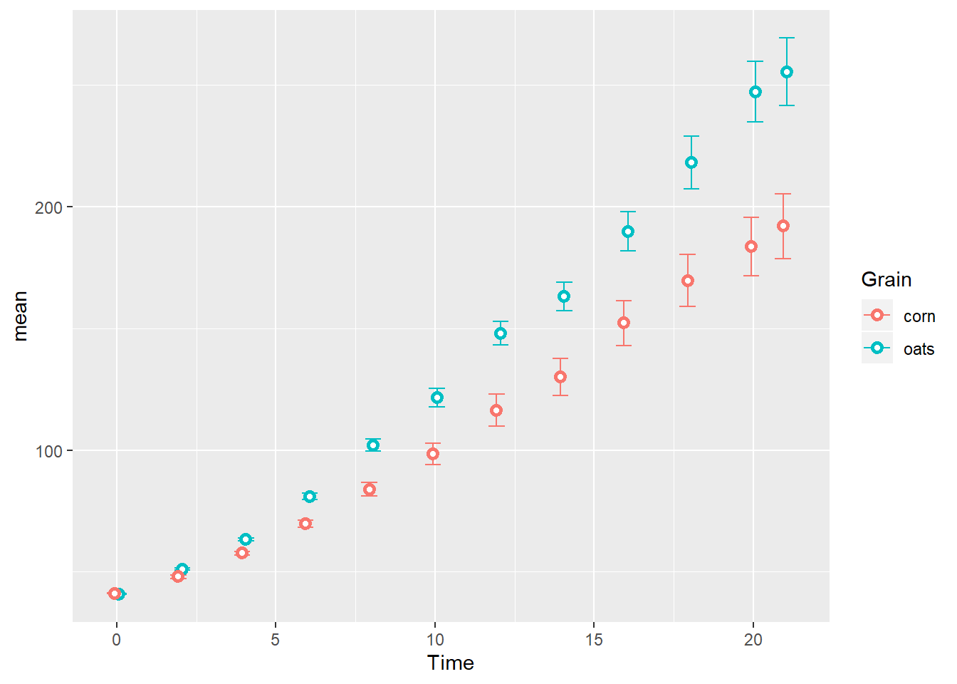
Next we connect the summarized observations by group along the time series, taking care to use the same position= argument for each geom:
TS_gg + geom_line(aes(group=Grain),
position=position_dodge(width = 0.25)) 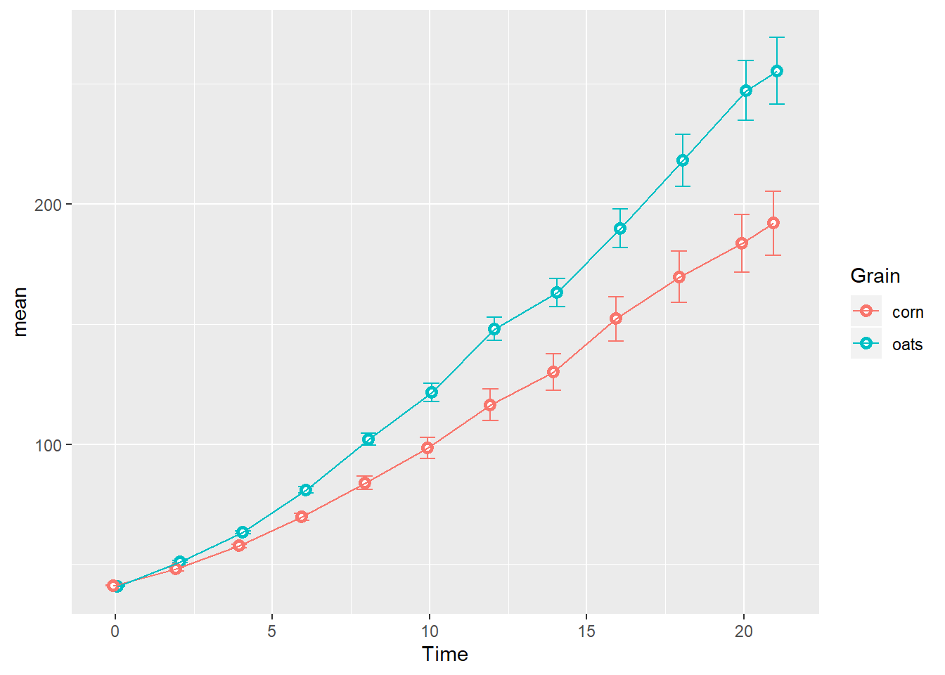
Again, this order is for illustrative purposes: I would normally add geom_line before geom_point so outlined points don’t have anything laying on top of them in the final plot.
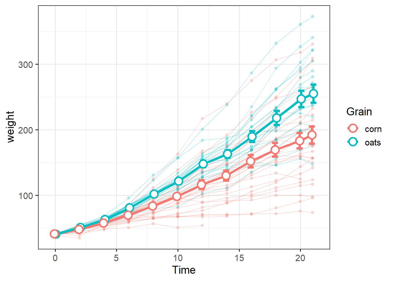
To show both the average weight of diet groups over time, along with trends in individual chicks, we can combine these data into a single plot.
We can draw emphasis to the group-level summary data by making the individual trends appear lighter via the alpha= argument, which essentially adds transparency:
grain_gg <-
  ggplot() +   theme_bw(14) +
    geom_line(data=ChickWeight,
              aes(x=Time,
                  y=weight,
                  color=Grain,
                  group=Chick),
              alpha=0.25) +
    geom_point(data=ChickWeight,
               aes(x=Time,
                   y=weight,
                   color=Grain),
               alpha=0.25) +
    geom_errorbar(data=TSsumm,
                  aes(x=Time,
                      color=Grain,
                      ymin=mean-sem,
                      ymax=mean+sem),
                  width=1,
                  lwd=1.5,
                  position=position_dodge(width = 0.25)) +
    geom_line(data=TSsumm,
              aes(x=Time,
                  y=mean,
                  color=Grain,
                  group=Grain),
              position=position_dodge(width = 0.25),
              lwd=1.5) +
    geom_point(data=TSsumm,
               aes(x=Time,
                   y=mean,
                   color=Grain),
               position=position_dodge(width = 0.25),
               shape=21,
               fill="white",
               stroke=1.5,
               size=4)
Note the empty ggplot() call and use of data= within each geom, which is good practice when using mutiple data sources in the same plot.
It helps keep track of which geom is responsible for each data.
We can add another level of information by facetting:
grain_gg + facet_wrap(~Source)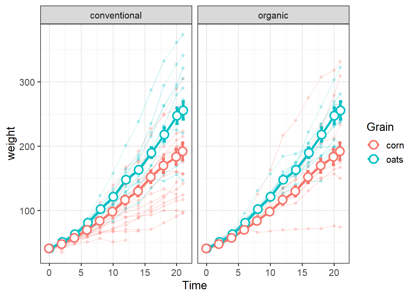
Here is an example of a more complex workflow ending with facet_grid and featuring a nested pipe to summarize data without creating a new \({\bf\textsf{R}}\) object.
In the tidyverse, the period . refers to the dataset coming in from above.
Most tidyverse verbs recognize data coming in via a pipe, but some functions need the data= argument and often accept ..
We need to start all over: remove ChickWeight and restore the default:
rm(ChickWeight)
(ChickWeight <- as_tibble(ChickWeight))
## # A tibble: 578 x 4
## weight Time Chick Diet
## <dbl> <dbl> <ord> <fct>
## 1 42 0 1 1
## 2 51 2 1 1
## 3 59 4 1 1
## 4 64 6 1 1
## 5 76 8 1 1
## 6 93 10 1 1
## 7 106 12 1 1
## 8 125 14 1 1
## 9 149 16 1 1
## 10 171 18 1 1
## # … with 568 more rowsPipe data into ggplot:
ChickWeight %>%
   mutate(Grain = recode(Diet,
                         "1"="corn",
                         "2"="corn",
                         "3"="oats",
                         "4"="oats" ),
          Source = recode(Diet,
                          "1"="conventional",
                          "2"="organic",
                          "3"="conventional",
                          "4"="organic")) %>%
  ggplot() + theme_bw(14) +
  geom_line(aes(x=Time,
                y=weight,
                group=Chick),
            alpha=0.25) +
  geom_point(aes(x=Time,
                 y=weight),
             alpha=0.25) +
  geom_errorbar(data=. %>%
                  group_by(Grain, Time) %>%
                    summarise(
                      mean=mean(weight),
                      sem= sd(weight)/sqrt(length(weight)) ),
                aes(x=Time,
                    ymin=mean-sem,
                    ymax=mean+sem),
                width=1,
                lwd=1.5,
                position=position_dodge(width = 0.25)) +
  geom_line(data=. %>%
                  group_by(Grain, Time) %>%
                    summarise(
                      mean=mean(weight),
                      sem= sd(weight)/sqrt(length(weight)) ),
            aes( x=Time,
                 y=mean,
                 group=Grain),
            position=position_dodge(width = 0.25),
            lwd=1.5) +
  geom_point(data=. %>%
                   group_by(Grain, Time) %>%
                     summarise(
                       mean= mean(weight),
                       sem=  sd(weight)/sqrt(length(weight)) ),
             aes(x=Time,
                 y=mean),
             position=position_dodge(width = 0.25),
             shape=21,
             fill="white",
             stroke=1.5,
             size=4) +
  facet_grid(Grain ~ Source)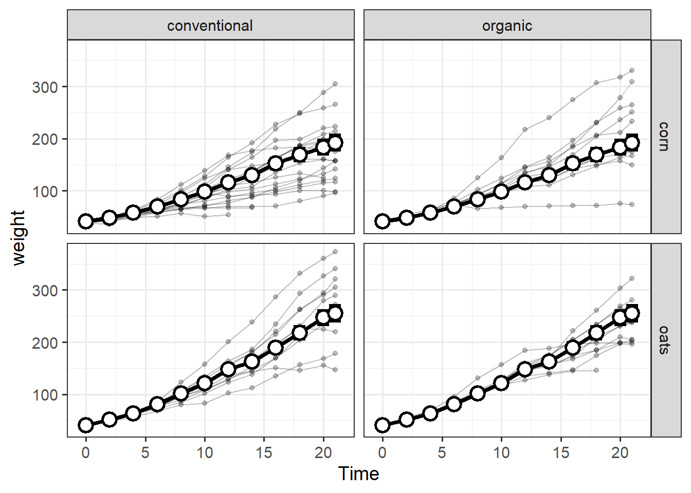
Homework
One could, of course, write their own function, e.g.
StdErr <- function(x) { sd(x)/sqrt(length(x))}.↩